Those who work with WordPress know what a theme is, but for all others: WordPress is the software behind numerous web pages, and a theme determines the appearance of a wordpress based website. I just change my theme to the Ashade WordPress theme.
Why I changed the theme
I am not an expert for web pages, nor do I want to be. I much prefer to deal with photography rather than HTML and CSS. I had my first PC already in 1984 and knew how to program it in machine language and assembler, but those times are long gone by.
WordPress is a brilliant software, and you can delve into it at will - but you do not have to. The change to a different appearance is a snap for websites with a simple structure. However, my website with theme specific settings can not be changed so easily any more. So why do I not use the Toranj theme any more which I used up to now?
I used Toranj for two years, and basically I was happy with it. The developers OWWWLabs had also another theme named Eram, which seemed even better to me, and it would have made the change easy. They lost their interest to maintain the theme, however. First they lost their presence at Themeforest, and a few weeks ago also at another distributor where they were afterwards. Working with a theme which is not supported any more is not a good idea. This is why I had to do someting about it and choose a new theme.
Choosing the Theme
There are numerous free themes, and also many which require a license. A permanent license costs usually betwen 30 and 70 USD, not much for something that often stands out.
Themeforest has previews for almost every theme, providing an easy first impression. Due to the number of themes it is still not easy, but some web pages recommend suitable themes for photographers. Many of these are worthwhile due to their interesting design, but this was not my only criterion.
I had these criteria:
- The theme must have a differntiating appearence which I like
- In order to minimize the risk for dropped support it should have a minimum of sales. I set my threshold to 1000 licenses sold.
- The theme must have frequent updates and must have been recently supported
- It should come with a pagebuilder to ease up designing specific page layouts, particularly for my blog
- I should be compatible with a multilanguage plugin
This decreased my selection drastically. At the end I had about 20 themes where I took a closer look. After this, only three remained where I considered a purchase.
One of these was Ashade, despite that it had only 900 license sales. However, it became available only at the beginning of the last year, so that I considered it as promising. It is also marked by Themeforest as a "hot" theme.
Even after a detailed study of the remaining themes it was not easy to see which one is best suited for the intended use. This becomes visible only after purchase, so the decision had to be made before extactly knowing what I will get.
Testing the Theme
I purchased the license mid December, but I did not want to test it on my active site. The required changes would make the existing theme non-functional, so I wanted to test it on a a local server on my PC. This was new to me, but I found a description at Kinsta where the process was well explained.
Once installed, I set up AShade with some text and pictures from my existing site.
Ashade Properties
Basic settings
Ashade has a well structured customizer for an easy definition of the most relevant settings.
Albums
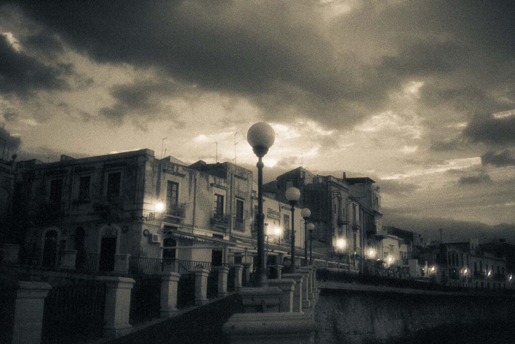
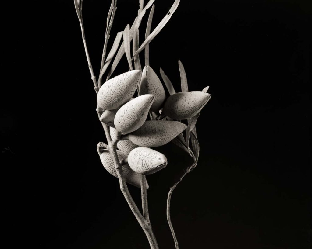
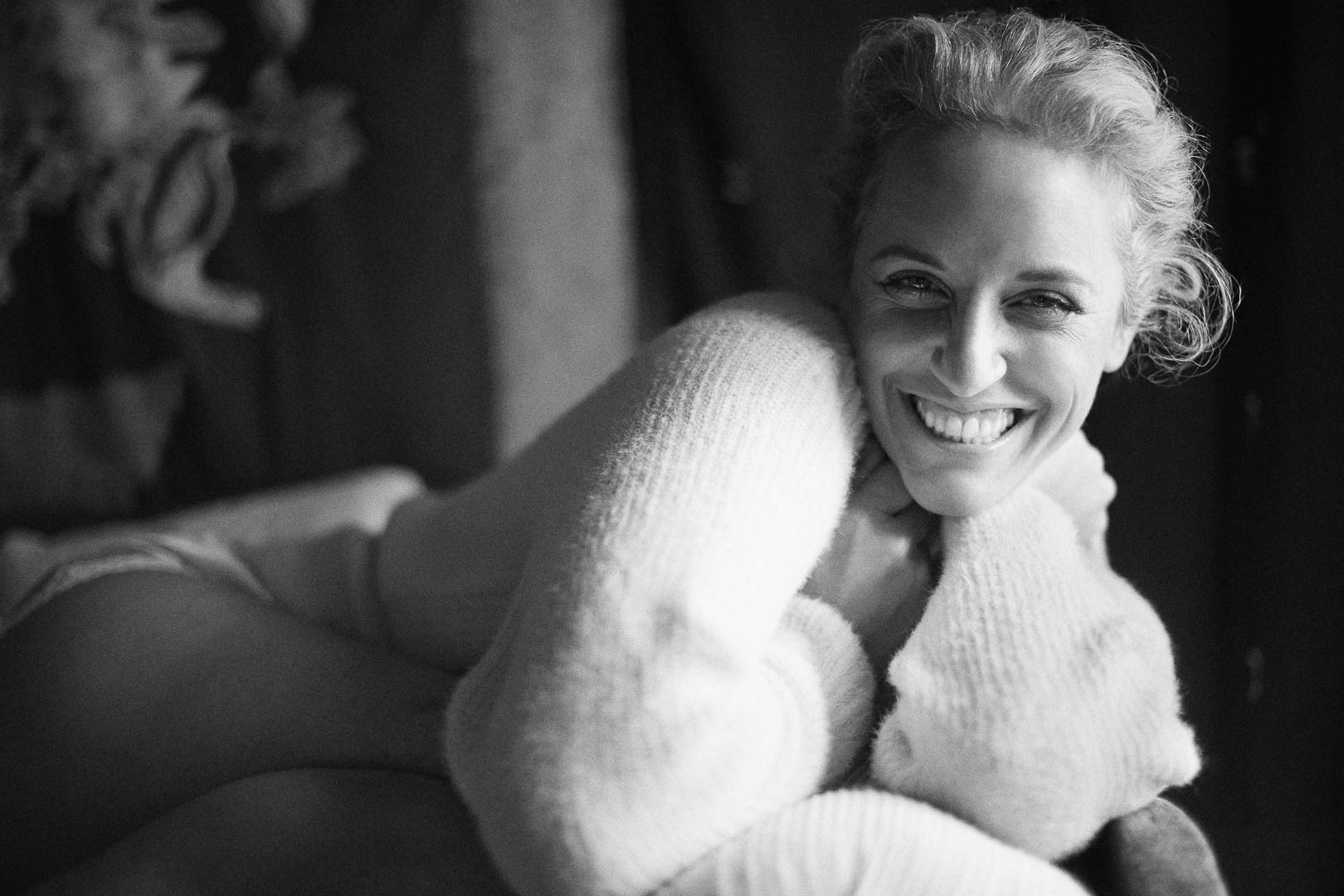
Albums are Ashade's main elements. They show the most important content of a photography website and determine the appearance. Ashade offers seven different album styles, which avoid showmanship and are pleasing to my eye. They can be as different as my albums to the right.
Each has options for configuration, for example whether the sequence is fix or random, for the number of coloumns and other.
As the examples show, text may be added above the content, but not for all album styles. Since text is important for search engine optimization, I hope that Ashade will find an unobtrusive option to add text also for the remaining albums.
If the album style permits to add text, it is entered as unstructured text in a field and will be shown above the content. Additionally, or as an alternative, structured text may be added with Elementor above or below the content. The last of my sample albums has such text which includes also an image and a link.
This content is not recognized by YoastSEO within the album itself, so my albums are marked red or orange at best, even if they contain text. However, YoastSEO works also within Elementor, and I hope that the search engines correctly associate this with the album.
Pages
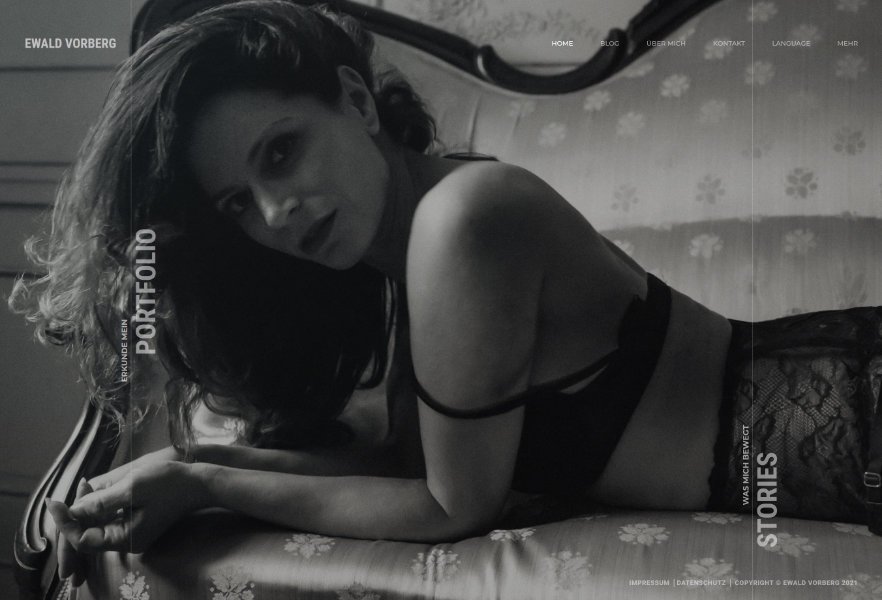
The second section ("work") determines the albums which are shown with the selection of the portfolio on the left side of my landing page. This is easily achieved: after assigning one or more categories and a featured image it can be selected here which categories will be shown. As evident from the sreenshot on the right I select only few of the assigned categories. The others are shown elsewhere. Accordingly, this definition determines the content of my Portfolio, which is called by the left menu bar. It can be seen from the URL that this calls the "work" settings.
Die dritte Ebene legt fest, was sich hinter dem rechten Menübalken verbirgt – “Stories” in meinem Fall. In der Standardeinstellung ist hier die Kontaktseite, so dass sie stark hervorgehoben wird. Da ich aber nichts für Kunden anzubieten habe, wollte ich das nicht so in den Vordergrund gestellt haben. Auf dieser Ebene können keine Alben angezeigt werden, doch läßt sich alternativ eine andere Seite auswählen mit der die Alben angezeigt werden. Hinter dieser Auswahl steht also eine separate Seite, die mit einem Klick auf “Stories" selects a different page. As the URL shows, this is not a selection from the landing page but a separately called page named "Stories".
There is one disadvantage of this approach: because it re-directs to a different page, the "Back" navigation button is missing. I hope this can be solved.
This separate page is similar to the "work" section of the landing page. The albums are selected by their categories, hence a little care must be taken to make the correct assignments.
Elementor
The Ashade license contains a free version of Elementor, but it has also some widgets of the full versioin - for example for adding galleries or orther functions, including a before/after slider.
My previous theme used WP Bakery for the page layout, which works differently. Elementor is much easier to use and does not leave code snippets as WP Bakery does. It implied also that my page had to be re-built. This was quite elaborate even for few posts as I had. However, since Elementor is much more attractive I decided to go for this change. This is the second post I write with Elementor. Now that the previous posts are re-designed I am quite happy with it.
Language Integration
Avalability of my website in English language is essential for me.
My base language is German, but most interface text is in English. Ashade recommends an excellent plugin which allows translation of text building blocks: Loco Translate. It is explained in a video which is provided by Ashade.
So far, I used the QTranslate XT plugin to translate my text. It works with most AShade fields, but since it is only partially compatible with Elementor a better plugin was necessary.
I briefly checked WPLang, but due to annual license fees I did not consider using it. PolyLang is an alternative and has a free version. It looks good at a first glance, but when it is activated it creates a second landing page in the additional language. In fact, this plugin always duplicates pages for the second language. Since the pictures are part of the album pages, this means that all albums need to be taken care of in duplicate. I suppose that even the pictures must be in duplicate, one with English and one with German titles. This was not an acceptable solution for me.
I then became aware of TranslatePress which permits in a very elegant way translation on the frontend and which does not require secondary pages. Even the free version works excellent, provided one additional language is sufficient.
I thought first that picture titles in thumbnails can not be translated, but when the picture is opened in the lightbox it can be translated there. Obviously, this will not work when the lightbox does not open, so it may be necessary to change temporarily the corresponding setting in the album or gallery.
Album titles can also not directly be translated in the thumbnails, but it can be translated when the album is opened. If the title is not visible there, the album must temporarily changed to a different style. The translation will stay even after reverting to the original style.
In summary, language integration was the most difficult part, and the need to translate everything anew caused a significant amount of work. But after having done this, I am very satisfied. And the plugin is even free.
The maintenance page
Support
I had several questions during implementation - also because I fear everything which carries HTML, CSS or PHP in its name. The Ashade support answered quickly, even on a sunday. All questions were solved. They even provided a short CSS code and theme components for changing the look of an album style. I suppose, these components will be part of the next update.
The excellent support reassured me that I made a good choice with Ashade.

9. July 2021 Author Ulrich Rossmann
Hallo Ewald, ich bin mehr durch Zufall auf deine Seite gestoßen und habe mich sehr über deine perfekt aufgebaute Ashade Seite gefreut. Ich war auch von dem Thema überzeugt, bin aber statt auf ‘Album’ auf ‘Seiten’ stecken geblieben.
Ich darf vielleicht hoffen, dass ich deine Site als Anregung nutzen darf, um mich endlich einmal in die von Ashade bereitgestellte Doku zu vertiefen. Das habe ch bis jetzt so gut wie nicht gemacht.
Ich glaube ich werde auch die Slider Parallax Funktion (wie in deinem Beispiel) umsteigen. Bisher bin ich in weiten Teilen bei einer Slideshow geblieben. Aber für einen Betrachter bietet das eine zu zwanghafte Betrachtung.
Danke für deine Erklärungen auf dieser Seite. Ich mache mich heute Abend an die Arbeit … 😉
urossmann.de – Da gibt es genug Fotos, aber auch noch genug Fehler auf der Seite.
Schöne Grüße
Ulrich
21. July 2021 Author ewald
Hallo Ulrich,
Ein Thema neu aufzusetzen erfordert einige Arbeit, garade für jemanden der sich lieber mit der Fotografie befasst als mit dem Web-Design. Ein ansprechender und nicht alltäglicher Auftritt ist aber zweifellos auch wichtig und war es mir wert, mich damit eingehender zu befassen.
Klar kannst du meine Seite auch als Anregung nutzen – wenn ich alles für mich behalten wollte, hätte ich nicht darüber geschrieben ;-).
Ich wünsche viel Erfolg bei der weiteren Arbeit mit Ashade – es lohnt, meine ich.
Viele Grüße,
Ewald